Charting Life
US Life Expectancy for Men and Women, 1900–Present
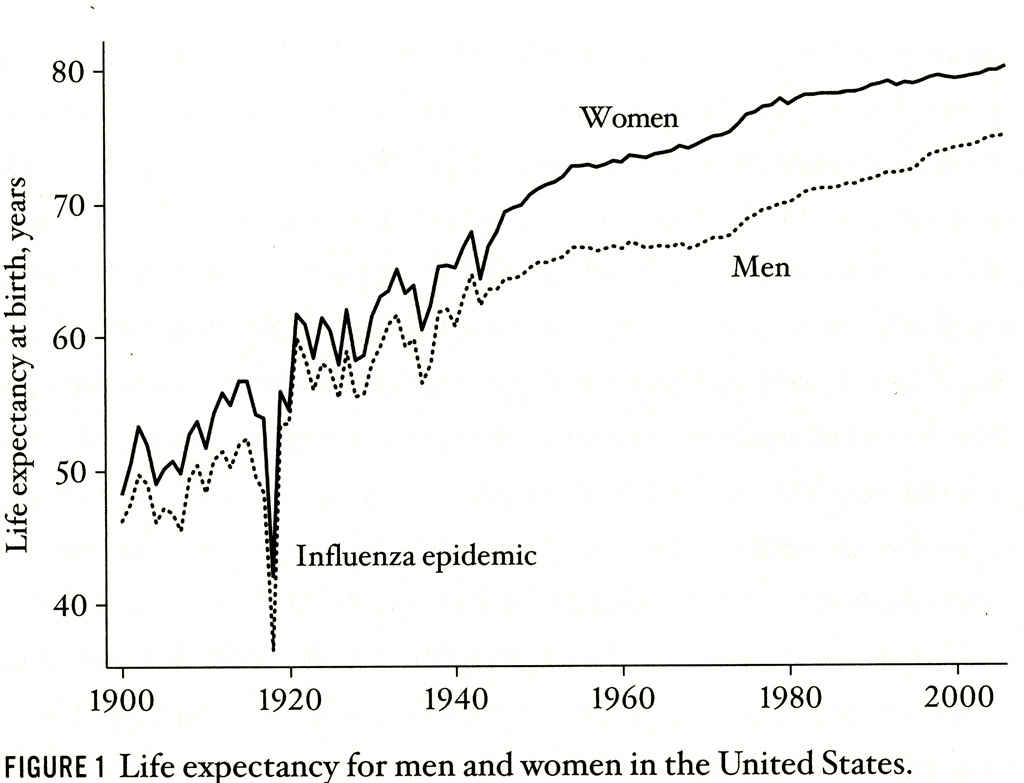
Life Expectancy for Men and Women in the United States, 1900 to the Present.
Charting Life
by John Grady
This is a simple line chart and easy to read. The vertical axis scales one type of information — in this case, how many years someone born in the US might expect to live — while the horizontal axis lists when people were born. A point on either line is an estimate based on projecting the death rates prevailing at that date into the future. Projecting a trend in this fashion, however, does not account for what the actual future might bring. Life expectancy in real time could be lowered by war, disease, famine, or a cataclysmic natural event. Conversely, our lives could extend beyond what was predicted at birth by improvements in living standards, medical care, and healthier lifestyles. For Americans, the big take away story from this chart is that the good far outweighs the bad.
Throughout human history, average life expectancy was anywhere from 30 to 40 years at best. Around 250 years ago in Western Europe and the United States, things slowly began to change. There was more food available; public health measures were taken; medical science improved, and housing became more secure and comfortable. By 1900, life expectancy was almost 50 years. What happened during the next century was without precedent in human history. By 2000 life expectancy had nearly doubled and men and women on average lived into their late 70s and early 80s.
Line charts are one of the best ways of visualizing a trend. They show direction: is it going up or down; is it even or uneven; curvilinear or cyclic? They show whether the rate of change is fast, slow, or non-existent. They also can be designed to include more than one line – in this case trends for men and women – and these can be easily compared. With these observations in mind, what does this chart tell us?
- While the growth of life expectancy is a steadily progressive trend over the course of the century, it tends to slow down from the early 1950s on for both men and women;
- Women tend to live longer than men and this discrepancy has generally widened since the beginnings of World War II. There is some evidence of a narrowing of the gender gap during the 1990s, which is probably due to men beginning to quit smoking in the 1960s in significant numbers, while women were just embracing the habit. There is a lag in outcomes for men and women because it takes about 30 years for the negative health effects of smoking to begin to take their toll – and for the positive effects of not smoking to have an impact.
- Before 1945 changes in life expectancy were very volatile. They go up and down by one or two years of life expectancy from year to year. This volatility is most likely due to outbreaks of various infectious diseases. After World War II, mass vaccination and expanded health care probably accounts for how steady the trend becomes for both men and women.
Because of the way that life expectancy is measured, it is very susceptible to being influenced by a dramatic increase in the death rate, even if that jump is limited to a very short period of time. The influenza epidemic of 1919 is considered the most lethal worldwide epidemic in history and killed more than 20 million people, 500,000 of them in the United States alone. This singular event was so massive that the slaughter it records leaves a distinct graphic trace on the chart as a plunging spike.
Charts are one of the best ways of examining social indicators. When done well, they provide us with clear measures of patterns that we might not otherwise be aware. Nevertheless, the care we take in viewing them is only as good as the care that must be taken in their preparation as well as observing and collecting the original information. The data that went into making this chart on life expectancy is reliable for just these reasons, and — because we can imagine what it measures – these simple lines speak volumes about what American civilization accomplished for its people over the last century.
-
Categories:
- Sociology