The Art of Not Freaking Out
By John Grady
On the first Friday of every month the American Media goes nuts! What they do is as predictable as clock work and just about as insightful. Their exercise in panic wouldn’t be such a big deal except that it tends to freak out Wall Street and unnecessarily confuses the American public.
In a nutshell what happens is this: at 8:30 AM the Bureau of Labor Statistics (BLS) announces the employment figures for the previous month telling us how many jobs were added to the economy and the current unemployment rate. These numbers are eagerly anticipated and estimated. At the beginning of the week several groups of economists predict what they think the numbers will be. On Wednesday a private company ADP Research releases its own estimate of job growth (or loss) in the private sector and then on Friday the BLS announces what they believe actually happened.
Here’s how it all unfolded in the first week June 2013. A poll of mostly unnamed economists predicted that there would be a growth of 165,000 jobs in the private sector. Not bad! But not nearly as much as would be needed to undo the damage of the Great Recession. On Wednesday, June 5th, however, ADP announced that the increase only amounted to 135,000 jobs. A little less good than what the economists predicted, but not a disaster. Remember we are talking about a difference of 30 thousand jobs in an economy that currently totals 136 million positions. This news, which was widely touted by every news service, contributed to a drop of over 200 points in the Dow Jones on Wednesday.
On Friday the 7th, however, the BLS reported that the private sector had actually added 178,000 jobs, which was higher than what both the economists predicted and ADP reported. Predictably, the immediate response of the stock market was to jump up 170 points or so within an hour of opening trading. This kind of manic response to the job news between Wednesday and Friday is not unusual. In April and May the oscillation in the stock markets was even wilder.
For sociologists this kind of response is harmful and the remedy is clear: put the numbers into context. In this case, the press should realize that the BLS job figures for any given month are only preliminary and will be revised in the two succeeding months. In February, for example, the BLS reported a job growth of 236,000. Two months later the second and final revision put the number at 332,000, or almost a 100,000 more. Similarly, March’s dismal report of 88,000 jobs — when the dust finally cleared — was revised upwards to 142,000, or 54,000 more than the original count. Sometimes, of course, the figures are revised downward. But always the lesson should be to look at the long-term trend.

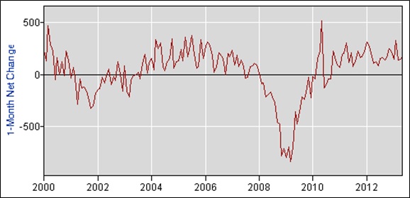
Figure 1: Series CES0000000001. One Month Net Change in Employment, Hours and Earnings from the Current Employment Statistics National Survey, Bureau of Labor Statistics, 2000-2013.
Figure 1 shows that not only do extended periods of dramatic job growth or loss correlate with the business cycle, but also periods of growth tend to fluctuate widely from month to month even as the trend continues. What this means is that trying to read the tealeaves in each month’s report is an exercise in futility. What the chart documents is that the economy today is growing, although not fast enough to repair the damage caused by the Great Recession any time soon.

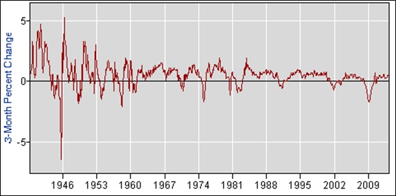
Figure 2: Series CES0000000001. Three Month Percent Change in Employment, Hours and Earnings from the Current Employment Statistics National Survey, Bureau of Labor Statistics, 1939-2013.
A bleaker picture emerges, however, when we adjust the chart to cover the period from 1939 to the present and have it measure the percentage change between periods – here measured in three-month intervals – rather than just the absolute number of jobs created or lost from the previous month. After all, an increase of half a million jobs over a three month period is a lot more substantial if the size of the employed work force was only 50 million as opposed to 140 million.
Figure 2 shows the same wave like alternation between recessions and periods of economic recovery except that it now covers almost three quarters of a century. What the chart also shows is a steady decline since the mid-1980s in the proportion of new jobs created in comparison to the economy as a whole, which is especially marked in the two recoveries since 2003 and 2010. This glance at a bigger picture reveals that we have lived through a prolonged quarter century of slow job growth with no real end in sight. Any discussion of policies that would improve the job picture has to identify – and then grapple with — what is causing this long-term slowdown in job creation.
The monthly media coverage of the job figures only focuses on the short-term and tends to trumpet two exaggerated take away stories: either jump for joy or off a building. Thinking sociologically, however, is a more responsible approach and always begins by putting an issue into context, which in this case means looking at longer-term trends. Reporters and pundits who have eaten their sociological spinach might find themselves not only writing in more measured tones but also addressing issues in a way that truly informs the public.
-
Categories:
- Sociology